The Science Behind Color Psychology and Its Impact on Your Office Space
Picture this: it's Monday morning, you step into your office, and you're greeted by a dull, gray space that looks like it was designed by someone who thought "50 shades of beige" would be a great theme for a workplace. How does that make you feel? If your answer is somewhere between "meh" and "ugh," you're not alone. The design of our office spaces has a significant impact on our mood, productivity, and overall well-being. And one of the most powerful aspects of design? Color psychology.
Now, before you roll your eyes and think, "Oh great, another article about how blue is calming and red is energizing," let me assure you that we're going to dive deeper than that. We'll explore the fascinating science behind color psychology and how it influences our daily lives in the workplace – all while keeping things light, engaging, and relatable because, let's face it, we could all use a little color in our lives.
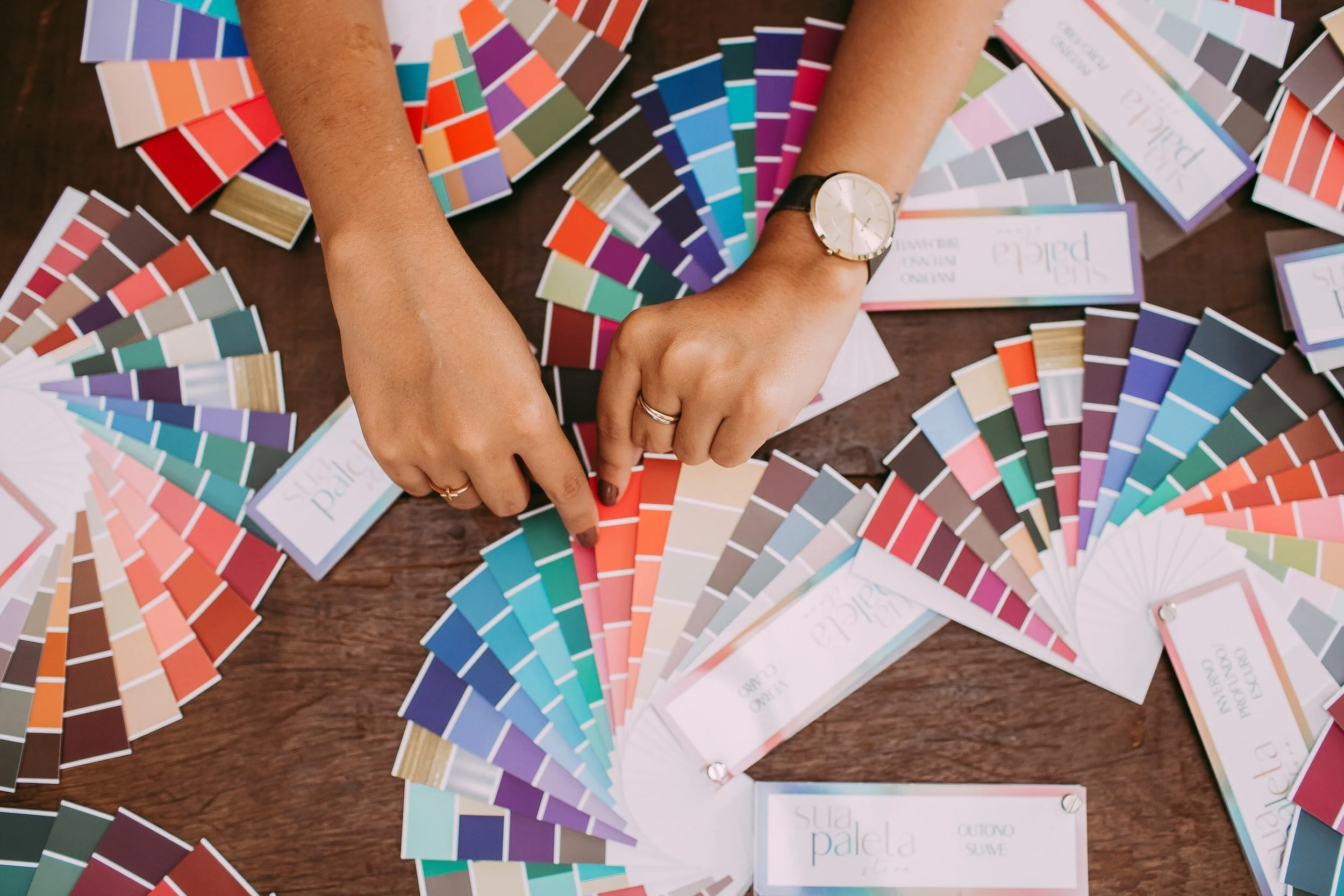
So, what exactly is color psychology? It's the study of how colors can affect our emotions, behavior, and even decision-making. It's like that time I painted my bedroom a vibrant shade of yellow, hoping it would make me feel happier and more energetic, only to realize I couldn't sleep at night because it felt like I was living inside a giant sunflower. The point is colors have power and understanding that power can help us create office spaces that are not only visually appealing but also promote productivity and well-being.
In this article, we'll delve into the science of color psychology, examining how our brains perceive and process colors and how different hues can influence our mood and behavior at work. We'll also discuss how to design an office space with color psychology in mind, ensuring that your workspace is a place where creativity, collaboration, and success can thrive.
So, grab a cup of coffee (preferably in your favorite colorful mug), and let's embark on this colorful journey together. Who knows? By the end of it, you might just be inspired to give your office a much-needed makeover – or at least convince your boss to invest in some snazzy new office chairs.
The science behind color psychology
Alright, now that we've set the stage, let's dive into the nitty-gritty of color psychology. We'll start by exploring the psychological effects of different colors and how our brain perceives and processes them. This is where things get really interesting – trust me, it's like discovering your favorite ice cream flavor has a secret superpower.
The psychological effects of different colors
Red - Picture yourself in a room with red walls. How do you feel? Energized? Excited? Maybe a little hungry? (I'm looking at you, fast-food chains.) Red is known for stimulating energy, excitement, and attention. It's like that friend who's always up for an adventure and can convince you to go skydiving on a whim. But be careful – too much red can also trigger feelings of aggression or stress.
Blue - Ah, blue, the color of calm seas and clear skies. It's no wonder blue is associated with calmness, focus, and stability. If red is the adventurous friend, blue is the one who helps you stay grounded and reminds you to breathe when you're feeling overwhelmed. However, darker shades of blue can evoke feelings of sadness or coldness, so choose wisely!
Green - Green brings to mind lush forests, thriving plants, and that one time I tried to keep a houseplant alive (RIP, Phil the Fern). It symbolizes balance, growth, and creativity. Green is like the wise mentor who helps you find harmony in chaos and encourages you to think outside the box. Just don't overdo it, or you might end up feeling like you're living in a jungle.
Yellow - Remember my sunflower bedroom fiasco? Yellow is the color of optimism, happiness, and energy. It's like a burst of sunshine on a cloudy day, lifting your spirits and filling you with warmth. But beware – too much yellow can lead to feelings of frustration or anxiety, so use it sparingly.
Orange - Orange is the fun-loving cousin of red and yellow, representing enthusiasm, motivation, and warmth. It's the color equivalent of a motivational speaker, inspiring you to tackle challenges head-on and embrace new opportunities. Just make sure not to go overboard, or you might end up feeling overwhelmed.
Purple - Purple is the color of sophistication, luxury, and creativity. It's like that fancy, velvet-clad friend who always knows the best wine to pair with your dinner. Purple can stimulate imagination and innovation, but if used excessively, it may come across as pretentious or overpowering.
White - White signifies cleanliness, simplicity, and clarity. It's like a blank canvas, offering a sense of calm and order amidst the chaos of everyday life. However, too much white can feel sterile or cold, so consider adding pops of color to keep things interesting.
Black - Black exudes power, sophistication, and seriousness. It's the classic little black dress of the color world – timeless, versatile, and always in style. But be cautious, as too much black can feel oppressive or gloomy.
How the brain perceives and processes colors
Now that we've covered the emotional impact of different colors, let's explore how our brains actually perceive and process them. It all starts with our eyes, specifically the cones in our retinas. These tiny cells are responsible for detecting color and sending that information to our brains. Fun fact: there are three types of cones, each sensitive to different wavelengths of light (red, green, and blue).
Once the cones have done their job, the visual cortex in our brain takes over, processing the color information and creating the vivid hues we experience. This is also where our emotional and cognitive responses to color stimuli come into play – remember my yellow room-induced insomnia?
In the next section, we'll discuss how color psychology plays out in the workplace and how to use this knowledge to create a more productive, harmonious office environment. So stay tuned because things are about to get colorful!
Color Psychology in the Workplace
Now that we've explored the science behind color psychology, it's time to apply our newfound knowledge to the place where many of us spend a significant chunk of our lives – the office. In this section, we'll discuss how color affects employee mood and behavior, as well as its influence on office communication and collaboration. So, buckle up and get ready to unleash your inner interior designer!
The Impact of Color on employee mood and Behavior
Effects on stress levels and emotional well-being - The colors of our work environment can have a profound impact on our stress levels and overall emotional well-being. Remember how blue can evoke feelings of calmness and focus? Incorporating shades of blue into your office design might just be the key to keeping those Monday morning blues at bay. On the other hand, excessive use of colors like red or yellow could potentially lead to increased stress and anxiety. So, it's essential to strike the right balance when choosing colors for your office space.
Effects on focus, concentration, and productivity - The colors that surround us can also influence our ability to concentrate and be productive. For instance, green has been linked to improved creativity and problem-solving, making it an excellent choice for brainstorming sessions or collaborative spaces. On the flip side, overly bright or intense colors can be distracting and hinder productivity, so it's essential to choose carefully and consider the specific tasks being performed in each workspace.
The Influence of Color on Office Communication and Collaboration
Color-related associations and their influence on team dynamics - Colors can carry certain associations and connotations that may affect the way we interact with our colleagues. For example, a meeting room painted in a bold shade of red might encourage assertiveness and lively debate, while a softer shade of blue might promote a more relaxed, open atmosphere. By considering these associations, you can tailor your office color scheme to foster better communication and collaboration among your team members.
Color cues for effective communication and problem-solving - Did you know that color can also serve as a powerful visual cue to enhance communication and problem-solving in the workplace? For instance, using color-coded sticky notes or whiteboard markers can help organize ideas and streamline the decision-making process during brainstorming sessions. So, don't underestimate the power of color when it comes to facilitating effective communication in your office!
Now that we've explored the impact of color psychology in the workplace, it's time to put that knowledge into action. In the next section, we'll discuss designing an office space with color psychology in mind, covering everything from choosing the right colors for different spaces to balancing color schemes for optimal impact. So, grab your paint swatches, and let's get to work on creating an office space that's as vibrant and inspiring as you are!
Designing an office space with color psychology in mind
Alright, folks, it's time to roll up our sleeves and get down to the business of designing an office space that harnesses the power of color psychology. In this section, we'll cover choosing the right colors for different office spaces, balancing color schemes for optimal impact, and adapting color psychology principles to various industries and work cultures. So, let's channel our inner HGTV stars and create a workspace that's both functional and fabulous!
Choosing the right colors for different office spaces
Private offices and workstations - When selecting colors for individual offices or workstations, consider shades that promote focus, productivity, and emotional well-being. Blues and greens are excellent choices for fostering a calm and focused atmosphere, while pops of yellow or orange can provide a boost of energy and motivation. Just remember to keep the overall color scheme balanced to avoid overstimulating or distracting employees.
Meeting rooms and collaborative spaces - The goal in these areas is to encourage open communication, creativity, and teamwork. Green is a fantastic choice for promoting creative thinking and problem-solving, while shades of blue can help create a relaxed and open environment. You might also consider incorporating bolder colors like red or orange to stimulate lively discussions and assertiveness – just be mindful not to overdo it, or you might end up with more heated debates than productive collaborations!
Break rooms and relaxation areas - Break rooms should offer employees a space to unwind, recharge, and socialize. Opt for soothing colors like soft blues and greens to create a calming atmosphere, while adding touches of warmer hues like yellow or orange can evoke feelings of happiness and warmth. Steer clear of overly bright or intense colors, as they can be overstimulating and counterproductive to relaxation.
Balancing color schemes for optimal impact
Complementary and contrasting color combinations - When planning your office color scheme, consider using complementary and contrasting color combinations to create visual harmony and balance. For instance, pairing a dominant color like blue with accents of its complementary color, orange, can create a visually appealing and stimulating environment. Don't be afraid to play with different shades and tones to find the perfect balance that suits your office's unique vibe.
The role of color accents and accessories - Sometimes, less is more when it comes to incorporating color into your office design. Instead of painting entire walls in bold hues, consider using color accents and accessories – think colorful chairs, artwork, or office supplies – to inject personality and energy into the space. This approach allows you to experiment with different colors and combinations without committing to a full-blown makeover.
Adapting color psychology principles to different industries and work cultures
Creative industries vs. traditional office environments - The ideal color scheme for your office may vary depending on the industry and work culture. For example, creative industries like advertising or design might benefit from bolder, more vibrant color schemes to inspire innovation and imagination. In contrast, more traditional office environments might opt for a subtler, more subdued palette to promote focus and professionalism.
Customizing color schemes for unique company values and goals - When designing your office space, consider how color psychology can align with your company's values and objectives. For instance, if your company prides itself on sustainability and environmental responsibility, incorporating shades of green throughout the office can reinforce that message and foster a sense of unity among employees.
Final Thoughts
Well, my fellow color enthusiasts, we've reached the end of our technicolor journey. We've explored the fascinating science behind color psychology, discovered how it influences our lives in the workplace, and learned how to design an office space that harnesses the power of color to create a positive, productive environment for all.
As you venture forth into the world of office design (or perhaps just daydream about giving your workspace a much-needed facelift), remember that the key is to strike a balance between aesthetics and functionality. Keep in mind the psychological effects of different colors and how they can impact mood, productivity, and collaboration. And most importantly, don't be afraid to get creative and let your unique personality and style shine through!
In the immortal words of the great Bob Ross, "We don't make mistakes, just happy little accidents." So go on, channel your inner artist, and create an office space that's as vibrant, inspiring, and full of life as you are. And who knows? Maybe one day, your coworkers will be thanking you for turning their once-drab office into a haven of color and creativity. Happy painting, my friends!